
Instagram’s New Wordmark: Why 53% of Users See “G-Zam” and What Marketers Need to Know
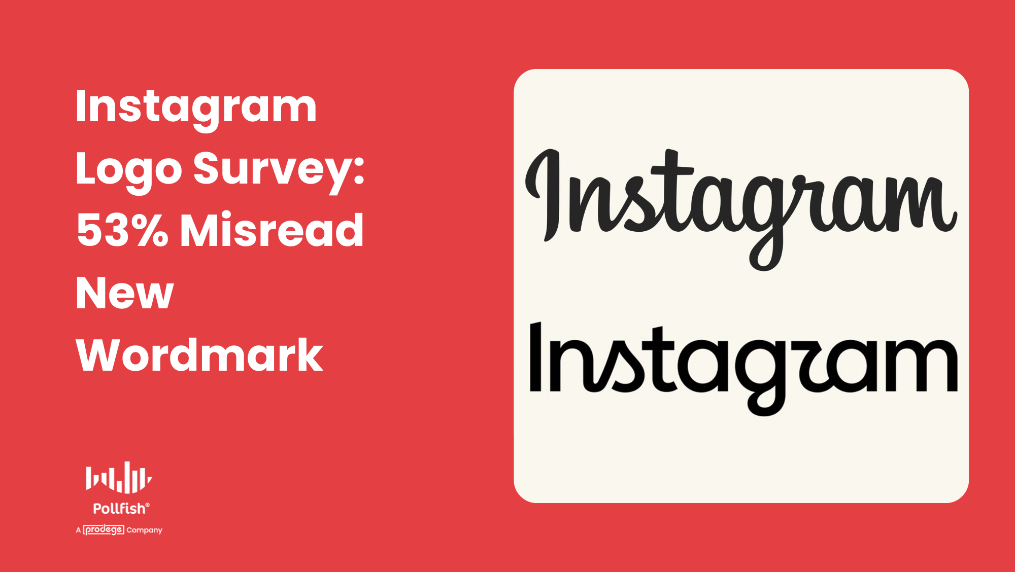 While 70% of consumers find Instagram’s modern wordmark update visually fresh, original research reveals a gap between aesthetic approval and functional legibility.
When Adam Mosseri, Head of Instagram, announced that the platform would be updating its iconic text wordmark, the marketing and design community immediately took notice. Aimed at modernizing the platform’s visual identity, the new look introduced a custom cursive typography intended to feel fresh and premium while retaining the spirit of the original brand script.
However, social media users took to the comments to both praise and critique the new typeface. Critics on Instagram and LinkedIn mainly pointed to legibility issues, especially the stylized cursive “r.” Commenters jokingly claimed the social media giant had inadvertently rebranded itself to “Instag-zam” or “Guam.”
To determine if this is just a trend-fueled phenomenon on Instagram and LinkedIn, we ran a rapid consumer survey on consumer survey platform, Pollfish, to capture unaided, real-time reactions to the new logo.
The data revealed that while consumers generally love the aesthetic, they find it hard to read.
Key Survey Findings at a Glance
- Legibility Failure: When shown a cropped half of the wordmark, only 47% of consumers correctly decoded the lettering as “Gram.” A majority (53%) saw something else entirely.
- “G-Zam,” “Guam,” and “G Cam”: Among those who misread the isolated wordmark, 27% read it as “G Zam,” 23% interpreted it as “Guam,” and 3% saw “G Cam.”
- Aesthetic Approval: The design is undeniably stylish: 65% of respondents rated the refreshed wordmark positively (38% giving it a top 5/5 score), and 70% agreed it looks “modern and fresh.”
- Legibility Disapproval: Ease of reading was the weakest tested attribute. Only 51% agreed the new wordmark is easy to read, while 22% actively disagreed and 27% remained neutral.
- Classic Logo Equity Prevails: In a direct side-by-side preference test, 69% of consumers still prefer Instagram’s classic wordmark over the new design (23%).
- Low Baseline Awareness: Prior to the survey, 70% of respondents had zero prior awareness of the update, proving that initial reactions reflect unaided decoding rather than pre-informed familiarity.
🎥 Prefer a quick visual recap? Watch our 60-Second Video Summary of the Instagram Logo Survey on YouTube
The Unprompted Recognition Test: Gram, G-Zam, or Guam?
To prevent bias, the Pollfish study opened with an unprompted visual test. Respondents were shown an isolated image of the signature wordmark section containing the new cursive script and cropped as pictured below.
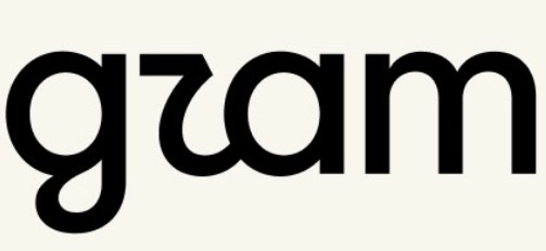
When asked what word or text string they saw in the image:
| Reported Reading | Share of Respondents |
| Gram (Intended Reading) | 47% |
| G Zam | 27% |
| Guam | 23% |
| G Cam | 3% |
Fewer than half of respondents spontaneously arrived at the intended brand cue.
Open-ended qualitative feedback confirmed that this stems directly from a letterform execution issue. The dominant spontaneous concern among 39% of respondents was that specific letters were hard to read, with 9% explicitly pointing to confusing cursive letterforms; most notably the cursive “r,” which was frequently mistaken for a “z,” “u,” or “7.”
This recognition hurdle was remarkably consistent across demographic groups, with correct recognition ranging from 56% among 18-24-year-olds down to 38% among 55-64-year-olds. This indicates that the legibility barrier is structural to the custom typeface itself, rather than limited to specific age demographics. This debunks what some have called out as being an issue due to Gen Z not knowing how to read or write in cursive.
The Aesthetic Paradox: High Approval, Functional Confusion
You might assume that a logo that more than half of users struggle to read would be universally rejected. However, overall consumer sentiment toward the redesign remains surprisingly positive.
On a 5-point reaction scale, the new wordmark earned an average reaction score of 3.8 out of 5, with 65% rating the look favorably (4 or 5 out of 5 stars). Only 12% gave it a negative score.
When evaluating specific design attributes, respondents readily awarded the update high marks for contemporary branding cues, but stalled on legibility:
- 70% agreed the design looks modern and fresh (26% strongly agreed).
- 64% stated the wordmark feels premium or high quality (33% strongly agreed).
- 63% agreed that it still feels like Instagram
- 29% praised the wordmark in open-ended comments for being unique and eye-catching.
How Well the New Wordmark Fits Key Design Attributes:
| Modern & Fresh | 70% Agree |
| Premium / High Quality | 64% Agree |
| Feels Like Instagram | 63% Agree |
| Easy to Read | 51% Agree |
This creates a distinct marketing paradox: The exact styling that makes the logo feel modern and eye-catching is the same element causing consumer confusion.
Head-to-Head Comparison: The Classic Wordmark Still Leads
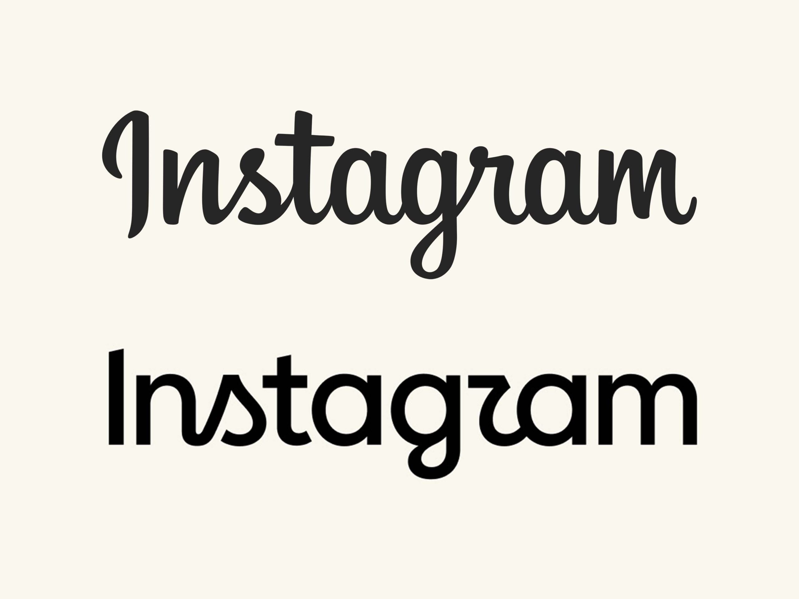 When respondents evaluated the classic Instagram wordmark directly against the updated version in a side-by-side choice test, familiar visual equity won by a landslide.
- 69% of respondents preferred the classic, established wordmark.
- Only 23% preferred the new wordmark.
- 8% had no preference or felt both looked fine.
Despite the 69% preference for the classic logo, consumer resistance to visual change is not absolute. When asked how major tech platforms should approach visual identity updates:
- 46% felt iconic logos should remain consistent.
- 31% supported regular refreshes to stay modern.
- 17% supported updates when the platform’s core product meaningfully evolves.
- 6% had no opinion.
Nearly half of consumers (48%) are open to logo modernization under the right conditions. However, when a brand update introduces legibility friction, users naturally default to the familiar, effortless asset.
4 Strategic Takeaways for Marketers, Brands, and Designers
Instagram’s wordmark refresh offers valuable strategic lessons for brand managers, agency creatives, and product designers:
1. Don’t Sacrifice Function for Form
Distinctiveness is a massive asset. 13% of respondents specifically noted the font choice as the most standout element of Instagram’s redesign. However, if the element making your logo memorable also causes 53% of people to misread it, you have an execution problem. Brands must refine ambiguous letterforms to improve instant legibility without losing their unique character.
2. Context is a Crutch
Prior awareness of Instagram’s update was low, with 70% of respondents hearing about the change for the first time through our survey. When tested inside the app interface, surrounded by camera icons, story rings, and familiar UI, brand context masks legibility flaws. However, when your wordmark stands alone across PR campaigns, billboards, co-branding assets, or hardware, it must be self-explanatory.
3. Rollouts Require Communication
When brand updates roll out without clear context, external internet commentary fills the void. Investing in a multi-channel rollout plan helps establish the rationale behind a rebrand, ensuring the narrative is defined by the brand rather than viral meme culture.
4. Validate Visual Assets via Blind Agile Testing
Traditional creative testing often evaluates complete packaging or full UI mockups where dominant brand cues overpower subtle typography issues. By running agile, unprompted asset tests on platforms like Pollfish, brand teams can catch misinterpretation risks—like a confusing cursive “r”—and optimize letterforms before going to market globally.
Survey Methodology
This study was fielded on August 13, 2026, using the Pollfish online survey platform. The sample comprised 100 adult social media users aged 18–64 residing in the United States, representatively balanced across age, gender, and geographic region. The survey utilized a combination of blind unprompted text decoding, monadic asset display, matrix attribute scoring, and side-by-side preference testing. Qualitative open-ended text responses were auto-clustered using Pollfish AI sentiment analytics.
About Pollfish
Pollfish is a mobile-first consumer insights platform that delivers real-time survey responses from over 250 million consumers worldwide. By combining agile methodology with precise demographic targeting and real-time visual asset testing, Pollfish helps brand marketers, agencies, and market researchers validate concepts, test creatives, and make data-driven decisions in hours, not weeks.
Want to see how your own brand assets perform? Launch your own consumer survey on Pollfish today to get real-time, actionable insights in minutes.
